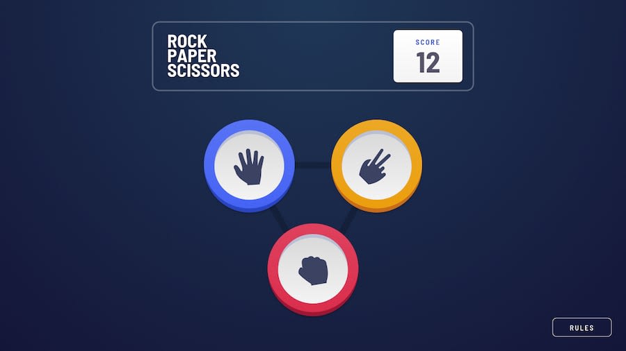
Rock, paper,scissors (extended) built with Vue and Sass.
Design comparison
Solution retrospective
It was a fun challenge and I'm open for tips/suggestions. Feel free to give any feedback.
Community feedback
- @MojtabaMosaviPosted over 3 years ago
Hi!, look good and functions accrodingly, two things to improve:
1- Upon resizing you see that the gameboard overflows and it does not look nice, you done a great job on everthing why let a small things like this mess up the whole thing.
2- Take to account the I am not an UX expert but I think it's better if you change the time function on your transition so that they happen more gracefully at the moment, it's to quick.
Keep coding :=)
Marked as helpful1@gsterczewskiPosted over 3 years agoThan you @MojtabaMosavi for taking the time and for useful feedback.
I will try to fix it soon.
See you on the coding trail 😉
Cheers!
0
Please log in to post a comment
Log in with GitHubJoin our Discord community
Join thousands of Frontend Mentor community members taking the challenges, sharing resources, helping each other, and chatting about all things front-end!
Join our Discord
