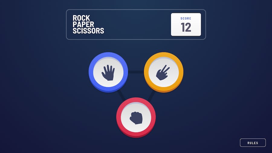
Design comparison
Solution retrospective
expecting feedback
Community feedback
- @blade-01Posted over 3 years ago
Try and set the score to 0, once the player loses a score from the point 0 it shows -1.
Happy Coding 💪
0@shaj-edPosted over 3 years ago@Tobesh01 actually i coded it like that everytime when user lose it will decrease the score negative score too, if look ugly will change it though
0 - @palgrammingPosted over 3 years ago
Looks good the only thing I see is the spacing of the you win/you loose button when the screen is like 1440px wide. When you win the button is beside the bulls eye graphic but when you loose the button is sitting on top of the bulls eye graphic and this looks much better and natural
But great project and it was fun to play a few rounds with it
0
Please log in to post a comment
Log in with GitHubJoin our Discord community
Join thousands of Frontend Mentor community members taking the challenges, sharing resources, helping each other, and chatting about all things front-end!
Join our Discord
