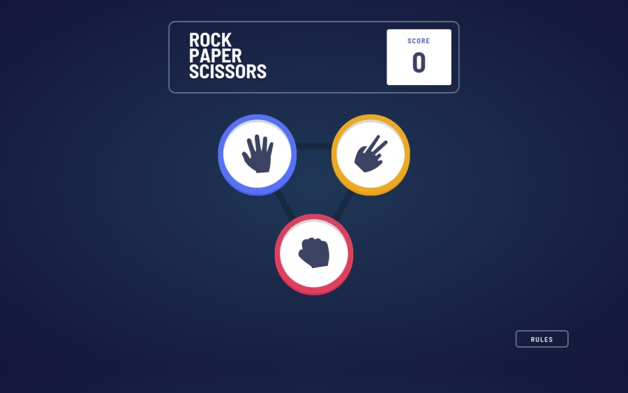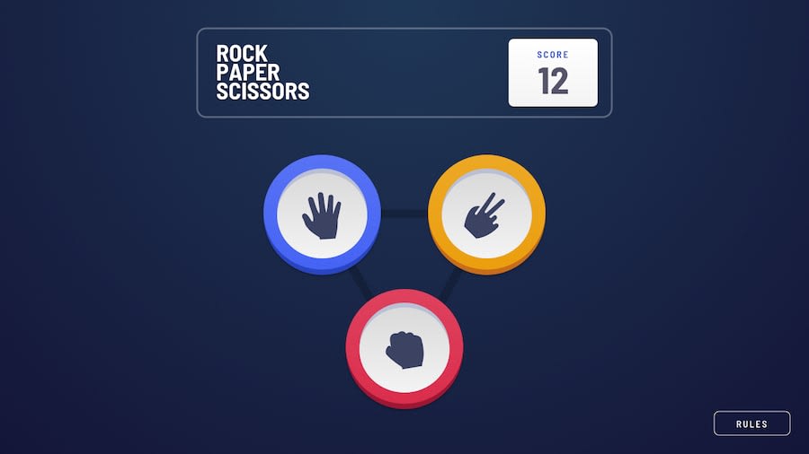
Rock, Paper, Scissors with React and Sass
Design comparison
Solution retrospective
Hello Everyone 👋
I finally got to finish this one and submit it after a while. I have been working on it for quite some time, I'd leave it, work on something else and come back to it. The JavaScript logic was fun, I really enjoyed it and I got to practice some React features. However, the CSS was quite tedious and painful to work with due to the fact that if you wanted to get it looking as close to the design as possible, there were significant differences between mobile and desktop designs. Maybe a CSS framework would have saved me a lot of time. 😎
I am still not satisfied with the layout are at the moment. I plan to work more on the responsiveness and the transition of the UI between the breakpoints. Even better, I'll create the bonus version.
Any feedback is welcome. I'll highly appreciate it. 👌
Please log in to post a comment
Log in with GitHubCommunity feedback
No feedback yet. Be the first to give feedback on Md5 dalton's solution.
Join our Discord community
Join thousands of Frontend Mentor community members taking the challenges, sharing resources, helping each other, and chatting about all things front-end!
Join our Discord
