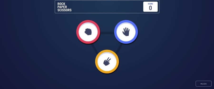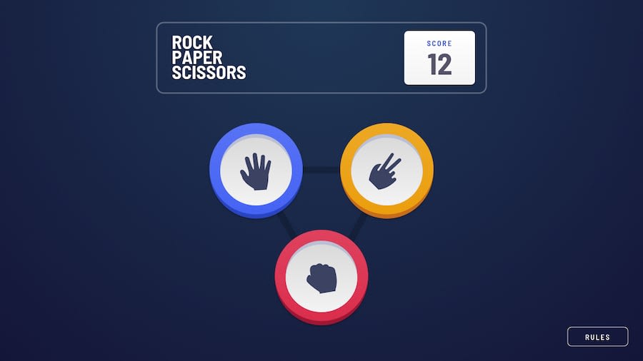
Rock, paper, scissors with NuxtJs and lots of box shadows :-p
Design comparison
Solution retrospective
As I've mentioned in other challenges, I am continuing to use these projects to get more reps in with NuxtJS. Each new project exposes me to a new way to approach something in VueJS and/or Nuxt, giving me an opportunity to dig in to the documentation and learn a new or better way to do something in this environment.
The layout for this project seemed pretty simple when I first looked at it. Interestingly, the layout was more difficult for me than the game logic. Yes, my eyes deceived me. :-) I haven't used CSS grid very much, and this project gave me an opportunity to do that. I’d like to rework this at some point to scale better.
Regarding the buttons:
I took advantage of multiple box shadows to achieve the interesting borders around the rock, paper, and scissor buttons.
A possible refactor?
I let my wife and daughter play this. They enjoyed it. They were wondering what they needed to do to “win.” It may be fun to refactor this game to have a winning score, and an associated view for winning. Perhaps, keeping track of the “house” score would be cool, too. If I do that, I’ll be sure to post the link in the comments.
As always, I welcome any constructive feedback.
Community feedback
- @mattstuddertPosted almost 5 years ago
Awesome work on this, Joshua! The CSS is deceptive for this challenge. It's definitely more involved than it looks like based on the design. One further step on this challenge would be to animate the changes in the state during the game and animating the
box-shadowfor the winner on each round.I really like the idea of adding in win/lose criteria for the whole game as well. I look forward to seeing what you come up with!
1
Please log in to post a comment
Log in with GitHubJoin our Discord community
Join thousands of Frontend Mentor community members taking the challenges, sharing resources, helping each other, and chatting about all things front-end!
Join our Discord
