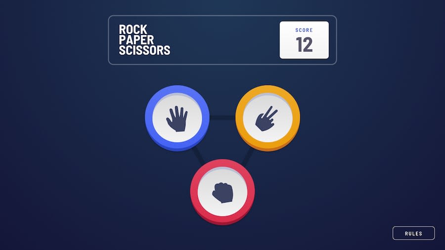
Design comparison
SolutionDesign
Solution retrospective
Any feedback is appreciated
Community feedback
- @artimysPosted about 4 years ago
Hi Tom,
Really good job on this challenge. The animation is great I think it's pretty slick. Just a few minor suggestions but overall great.
- when I click the "PLAY AGAIN" button, it feels like a really long second. Maybe if it can reset quicker
- moving from desktop to mobile view, the rock/paper/scissor section snaps up a few pixels and no longer becomes vertically centered
- The closing
ximg for the modal maybe deserves acursor: pointeras well as "RULES" button. - A hover state for the "RULES" button
Keep on coding!!
1 - @ApplePieGiraffePosted about 4 years ago
Hey, Tom Trung Zacchia! 👋
I think your animations are really cool! Great work! 🙌
Follow artimys' suggestions and you should be good to go! 😉
Keep coding (and happy coding, too)! 😁
0
Please log in to post a comment
Log in with GitHubJoin our Discord community
Join thousands of Frontend Mentor community members taking the challenges, sharing resources, helping each other, and chatting about all things front-end!
Join our Discord
