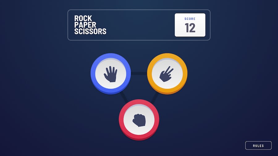
Rock, Paper, Scissors using Vite, Tailwind, Vue 3 and Pinia
Design comparison
Solution retrospective
Another very interesting challenge and fully enjoyed coding this. I used Vue 3 and Pinia to state manage the game like keeping track of the score, the counter the player chose and managing which screen should be shown.
I do prefer to use Vue when there's transition and animation involved between components as I think Vue handles this well. The layout is fully responsive which turned out quite well.
Community feedback
- @gabrielteresczukPosted over 2 years ago
Nice desing man!. I really loved the animation between the interactions. I saw just a little visual problem, with the backgrand color, when you put the height: 100vh, the background breaks any content after 100vh, and the backgraund repeat the gradient. -tested in 375px after win/lose the hand.
Muy buen diseño!, me encantaron las animaciones entre las interacciones. Solo encontre un pequeño problema visual, con el background color, cuando pones height:100vh, the fondo se rompe al pasar ese 100vh y repite el mismo radial gradient. -tested in 375px despues de ganar/perder la mano.
1@warrenleePosted over 2 years ago@gabrielteresczuk thanks for pointing that out, made the fixes!
1
Please log in to post a comment
Log in with GitHubJoin our Discord community
Join thousands of Frontend Mentor community members taking the challenges, sharing resources, helping each other, and chatting about all things front-end!
Join our Discord
