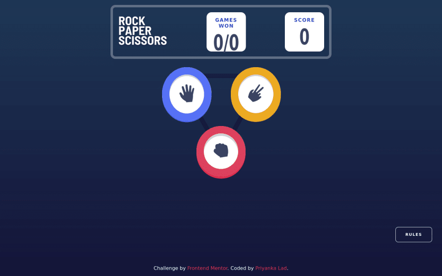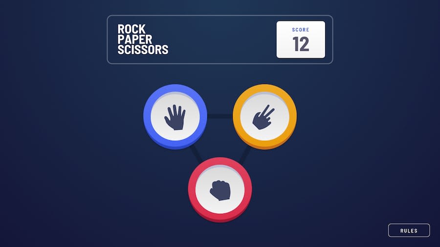
Design comparison
Solution retrospective
This solution is the first draft. In the next version I will implement the bonus part along with few animations and modular css.
I have below 2 queries though:
-
Although the application functionality is running as per the expectation, the UI does not feel smooth. On page load, three images first appear on the top and then moved to the middle. Same happens with header items. they shift positions on full page load. Does anyone have any idea why it is behaving like this?
-
I have included all properties in single reducer slice(gameSlice) as all properties are related to one another. Is it ok to have a single reducer with these much properties?
Eagerly awaiting for the feedback :)
Community feedback
Please log in to post a comment
Log in with GitHubJoin our Discord community
Join thousands of Frontend Mentor community members taking the challenges, sharing resources, helping each other, and chatting about all things front-end!
Join our Discord
