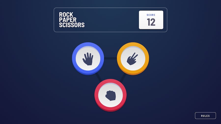
Design comparison
Solution retrospective
Any and all critique is welcome and appreciated. Also, my highscore is 6, let me know if you beat that!
Community feedback
- @legion40216Posted over 2 years ago
For some reason i cant scroll down. I loved the animation how the cpu waits and then picks and the smooth animation of score counter, can u tell me how u did it
1@HazipanPosted over 2 years ago@legion40216 The computer doesn't wait to pick. It simply has it's result invisible. Each has an animation set to 5s, the first one fades in right away, then the computer's choice fades in after ~1s. The score counter was made by storing the previous score and having it be displayed at the results screen. The current score is placed directly on top of it, but invisible. Then I have the previous score fade out and the current score fade in. You can't scroll down because I made it that way. I thought I optimized it enough that no scrolling was needed. I'll fix it so you can scroll down if the content doesn't entirely fit. Thanks for leting me know!
1
Please log in to post a comment
Log in with GitHubJoin our Discord community
Join thousands of Frontend Mentor community members taking the challenges, sharing resources, helping each other, and chatting about all things front-end!
Join our Discord
