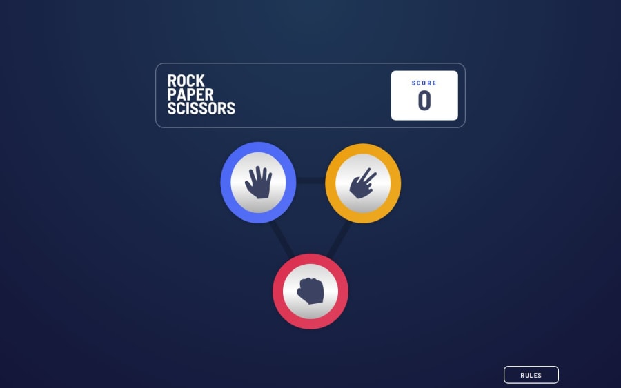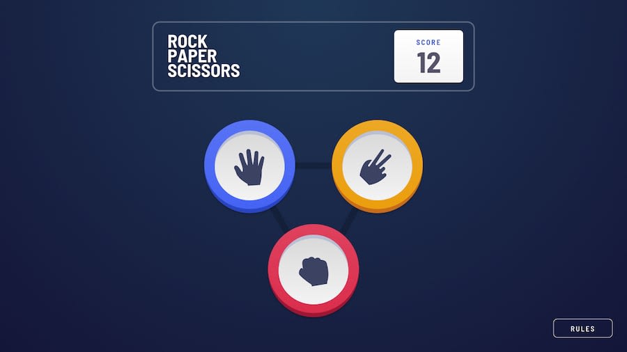
Design comparison
SolutionDesign
Solution retrospective
What specific areas of your project would you like help with?
I had trouble with the shadows in the buttons, if you know how to make it appear more like the original design it would be much appreciated.
Community feedback
- @MikDra1Posted 5 months ago
I think you should create another element (like with the ::after) and then position it absolute to the button. Then you would have to move this ::after a little bit of.
.btn::after{
content: '';
position: absolute;
top: 2rem;
left: 0;
border-radius: the same as on the btn;
If this comment was useful please mark is as helpful 💗
Good job and keep going 😁😊😉
Marked as helpful0
Please log in to post a comment
Log in with GitHubJoin our Discord community
Join thousands of Frontend Mentor community members taking the challenges, sharing resources, helping each other, and chatting about all things front-end!
Join our Discord
