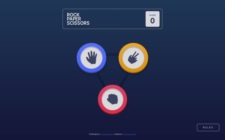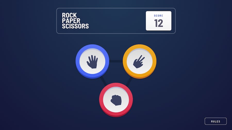
Design comparison
SolutionDesign
Solution retrospective
Hey! My first submission here, check it out)
I started this challenge with a simple HTML/CSS/JS approach and had fun with:
- using different borders to create a 3D effect on the action buttons
- using grid for buttons layout
- using transition on grid column and row sizes
My next steps would be refining transitions and adding the bonus part of the challenge (Rock, Paper, Scissors, Lizard, Spock).
Feedback is welcome and appreciated!
Community feedback
Please log in to post a comment
Log in with GitHubJoin our Discord community
Join thousands of Frontend Mentor community members taking the challenges, sharing resources, helping each other, and chatting about all things front-end!
Join our Discord
