Submitted about 2 years ago
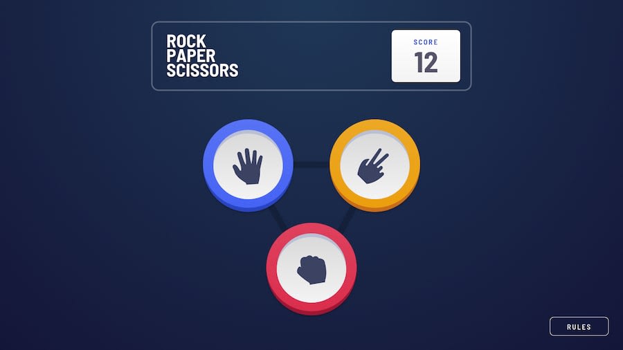
Rock Paper Scissors Lizard Spock using React-Redux
@Emvil-git
Design comparison
SolutionDesign
Solution retrospective
My main challenge area with this app was the responsiveness. I couldn't get it to work in a "clean" way (i.e. way too many lines just to make it look good on awkward media breakpoints, etc.).
What are the better ways to make this app responsive?
What should the gameboard component look like DOM-wise?
I still had fun making this, though. Will use any suggestions/criticisms to improve future projects. :>
Community feedback
Please log in to post a comment
Log in with GitHubJoin our Discord community
Join thousands of Frontend Mentor community members taking the challenges, sharing resources, helping each other, and chatting about all things front-end!
Join our Discord
