Design comparison
SolutionDesign
Community feedback
- @hannah-saurusrexPosted over 4 years ago
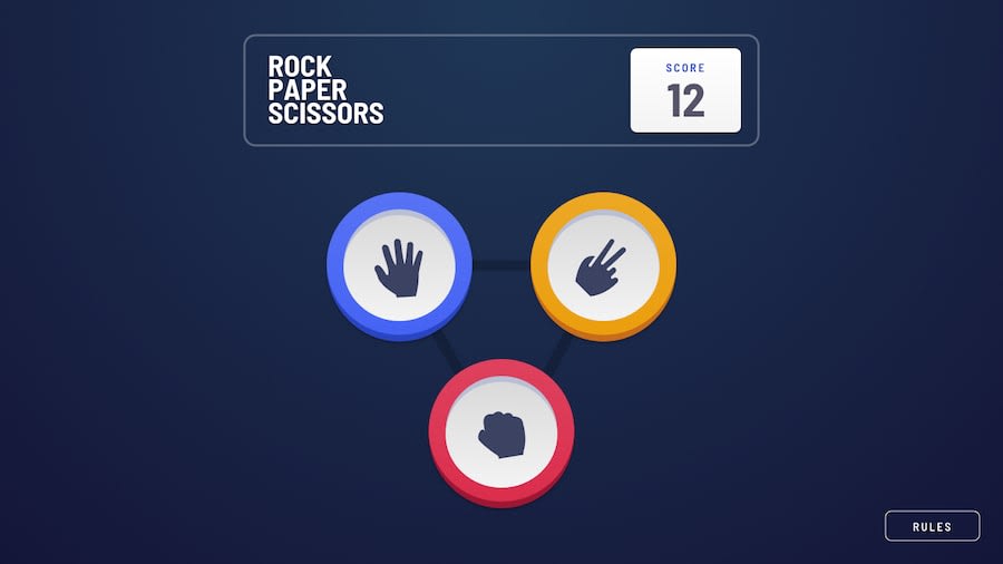
Awesome job! The transitions are super smooth. I love the way the 'computer picked' tiles come onto the page, and the two sections slowly move apart as the 'play again' button comes on.
1
Please log in to post a comment
Log in with GitHubJoin our Discord community
Join thousands of Frontend Mentor community members taking the challenges, sharing resources, helping each other, and chatting about all things front-end!
Join our Discord
