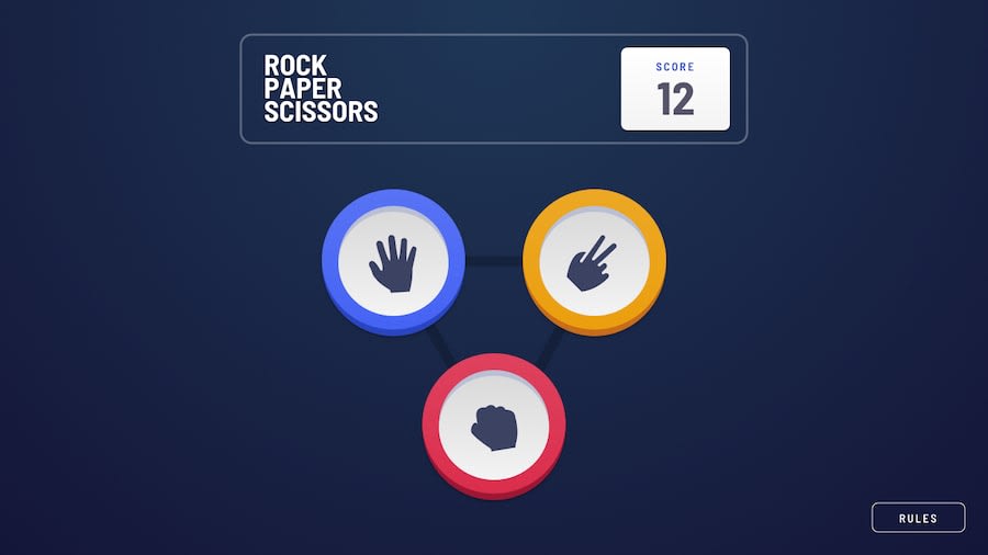
Design comparison
Solution retrospective
Huh! this was a hard one I went for the bonus challenge but am happy because the overall functionality works perfectly
What challenges did you encounter, and how did you overcome them?The hardest bit of this challenge is actually making the tiles look exactly like they are in the specs,like come on you are only given an svg and you are supposed to make it look like an 3D tile I tried lots of ways but finally landed on the idea of using box shadows and I kind of like the overall results though still needs some tweaks here and there but am happy with it
What specific areas of your project would you like help with?Actually the circular thingy coming of the tile when there is a win am still having hard time creating that but I like the overall results
Community feedback
Please log in to post a comment
Log in with GitHubJoin our Discord community
Join thousands of Frontend Mentor community members taking the challenges, sharing resources, helping each other, and chatting about all things front-end!
Join our Discord
