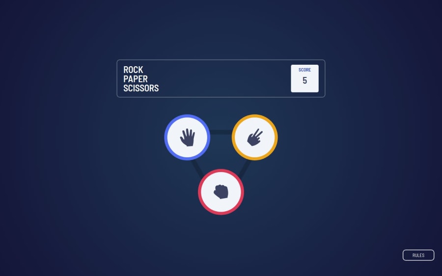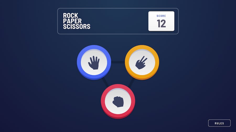
Design comparison
Solution retrospective
What I am most proud of: I am most proud of successfully integrating Tailwind CSS into my project. This was my first time using Tailwind, and I managed to create a visually appealing and responsive Rock-Paper-Scissors game. Additionally, I’m proud of the interactive elements and the smooth user experience achieved through React's state management.
What I would do differently next time: Next time, I would focus more on the optimisation of the game logic and perhaps introduce more features such as animations or sounds to enhance the user experience. I would also like to explore using custom hooks in React to make my code more modular and reusable.
What challenges did you encounter, and how did you overcome them?Challenges:
-
Learning Tailwind CSS: Since this was my first time using Tailwind, I found it challenging to get used to its utility-first approach.
-
State Management: Managing the state for user choice, computer choice, and the game result in React required a good understanding of React's state and lifecycle.
-
Responsive Design: Ensuring that the game looks good on all screen sizes was a bit tricky, especially with the positioning of elements.
How I overcame them:
- Learning Tailwind CSS: I overcame this by going through Tailwind's official documentation and looking at various examples. I also practiced by creating small components before integrating them into the main project.
- State Management: I broke down the problem into smaller parts and used React's useState hook to manage each piece of state. I also referred to React's documentation and various online tutorials to better understand state management.
- Responsive Design: I used Tailwind's responsive utilities extensively and tested the game on different screen sizes. I also used CSS Grid and Flexbox for better control over the layout.
- I would love feedback on how I can further optimise my code, particularly the game logic and state management. _ While I have a basic understanding of Tailwind, I would appreciate any tips or advanced techniques that can help improve my styling workflow.
Community feedback
Please log in to post a comment
Log in with GitHubJoin our Discord community
Join thousands of Frontend Mentor community members taking the challenges, sharing resources, helping each other, and chatting about all things front-end!
Join our Discord
