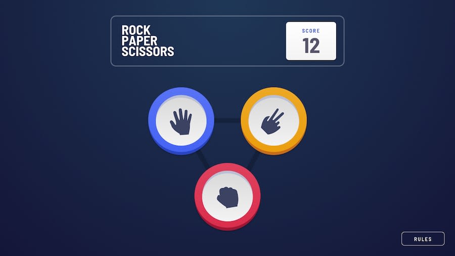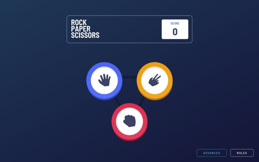
Design comparison
SolutionDesign
Solution retrospective
Any feedback is welcome!
Community feedback
- @Cats-n-coffeePosted over 1 year ago
Hi Mark! Great job on this game challenge! I'll give as much feedback as I can (I'm on FF, 13 inch laptop).
- the bottom choice button (red choice, fist in normal mode) is hidden by the Advanced and Rules buttons. It could be a layout issue? This results in the red choice being only clickable on its top half, unlike the others which can be clicked entirely.
- between 700px and 870px the Advanced button overlaps the red choice.
- when switching to Advanced the bottom 2 options are cut off from the screen, maybe you're missing a vertical scroll?
- Normal mode in mobile size looks very neat!
- line 38 of
GameChip.tsx
could be on multiple lines to make it easier to read. - in
RoundStarter.tsx
, I wonder if you'd be able to make theelse if
on line 25 easier to read by storing values in a object like this:
const matches = { rock: ['scissors', 'lizard'], paper: ['rock', 'spock'], // all the rest } // then in "else if" you can check the key and values matches[pickedChip].includes(pickedComputerChip) // this probably doesn't work, but you get the point
- Your overall project structure is good, and easy to follow!
Let me know if you have questions!
Marked as helpful1@MarksKolbanevsPosted over 1 year ago@Cats-n-coffee A big thanks for advice about storing values as an object!
0
Please log in to post a comment
Log in with GitHubJoin our Discord community
Join thousands of Frontend Mentor community members taking the challenges, sharing resources, helping each other, and chatting about all things front-end!
Join our Discord