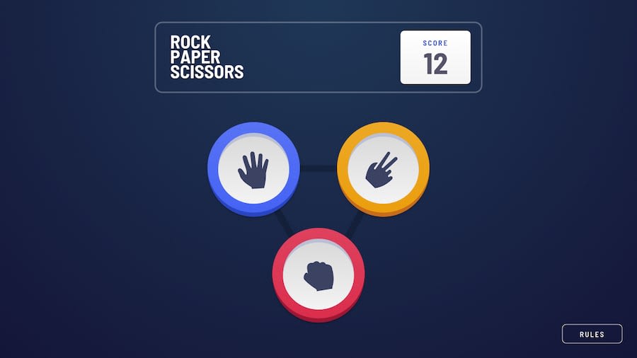
Design comparison
SolutionDesign
Solution retrospective
this is my first experience doing something like this, it was pleasant and productive, I would like your feedback.
In the future I still intend to:
- coder the second version of the game.
- optimize the code making it more concise.
this was a great opportunity to train my animation skills, hope you like it.
Community feedback
- @MarcusTuliusCiceronPosted over 2 years ago
I'm beginner so I can't help you with anything but your solution looks very clean, hope I will be able to do that in few weeks/months :D
1@webguy83Posted over 2 years ago@MarcusTuliusCiceron Good start! I noticed your header and play again button do some funky scaling behaviours though when you progress to mobile view so might need to fix that up a bit. I would also speed up the animations too by a lot.
0
Please log in to post a comment
Log in with GitHubJoin our Discord community
Join thousands of Frontend Mentor community members taking the challenges, sharing resources, helping each other, and chatting about all things front-end!
Join our Discord
