
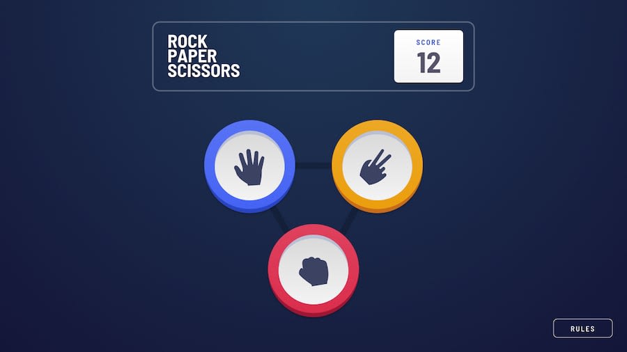
Rock Paper Scissors Game made in HTML, CSS, and JavaScript


Design comparison
Solution retrospective
A whole game make in 12 hours. Code is messy, but functional and (mostly) responsive on smaller screens. I would say it's good enough. Feedback is welcome.
Community feedback
- @clarencejuluPosted over 2 years ago
Hello, The game works very well, however your icons overlap each other. I think it would be a good idea if you remove the 'height: 100vh' setting on your body element. You could also use REM values and reduce the root font-size when the screen size reduces so the app looks better on small screens. The app looks good but could look better on smaller screens.
Goodluck!
0@liquidwater0Posted over 2 years ago@clarencejulu Oh yeah, I did not think about using rems for small screens. Great idea. The way I put together the CSS was a bit messy. I do not plan to work on the solution any more as of right now, but I may end up revisiting it sometime and fixing it up more. Thanks for the feedback. Also I could have done the winner button shadows better. I could have used box shadows instead of psuedo elements, but I did not think of it at the time.
0

Please log in to post a comment
Log in with GitHubJoin our Discord community
Join thousands of Frontend Mentor community members taking the challenges, sharing resources, helping each other, and chatting about all things front-end!
Join our Discord