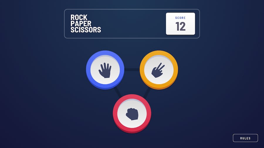
Rock, Paper, Scissors game. HTML, SCSS, Vanilla JS
Design comparison
Solution retrospective
Any feedback would be appreciated. Thank You!
Community feedback
- @webguy83Posted over 2 years ago
Just a few minor things: on mobile view the shadow on the pegs look quite large in relation to the size of the smaller pegs. I think in the mockups they had it a bit smaller. Also the image icons in the pegs are quite large in relation to the same issue. In the mockups they have the Rules button at the bottom right corner of the desktop screen and the bottom center in mobile. I would also vertically align the main playing area as it sort of sticks to the top when you expand the height. In your modal RULS is spelled wrong. Should be RULES. Rock Paper Sciccors text should be shrunk a bit as stated in mockup when in mobile view too.
Marked as helpful0@abubkar-ahmedPosted over 2 years ago@webguy83 Thanks a lot for the feedback I will be working on it soon.
1 - @dostonnabotovPosted over 2 years ago
Great job! That looks perfect!
1
Please log in to post a comment
Log in with GitHubJoin our Discord community
Join thousands of Frontend Mentor community members taking the challenges, sharing resources, helping each other, and chatting about all things front-end!
Join our Discord
