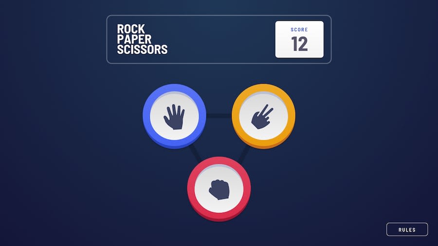
Submitted almost 2 years ago
Responsive landing page with pure css-html-javascript
@Ayush211107
Design comparison
SolutionDesign
Solution retrospective
anyone can help about,how to change the svg background position and its size according to screen width.
Community feedback
- @iDamjanPosted almost 2 years ago
Hey Kumar,
you can do this with Media queries. Just add @media (max-width:40em) { background-position: (desired position)} this will trigger different styles starting from 40em, or you can set your desired width trigger.
I hope this was the answer you were looking for!
Let me know if i can help with anything else.
Happy holidays!!
0
Please log in to post a comment
Log in with GitHubJoin our Discord community
Join thousands of Frontend Mentor community members taking the challenges, sharing resources, helping each other, and chatting about all things front-end!
Join our Discord
