Submitted almost 3 years ago
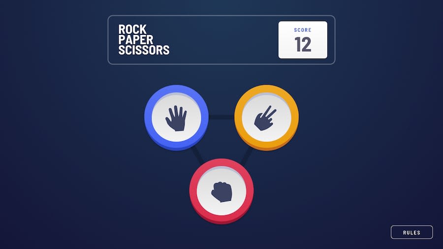
Rock, Paper, Scissors game vs. computer with Local Storage and Sound.
#sass/scss
@clarencejulu
Design comparison
SolutionDesign
Solution retrospective
I found building the layers of the icons tough. Therefore I didn't do the cicles that go round the winner. Did anyone find them easy?
How does the project look in general?, Can you spot any errors or possible impovements?
Thank you in advance.
Please log in to post a comment
Log in with GitHubCommunity feedback
No feedback yet. Be the first to give feedback on Clarence Onumajulu's solution.
Join our Discord community
Join thousands of Frontend Mentor community members taking the challenges, sharing resources, helping each other, and chatting about all things front-end!
Join our Discord
