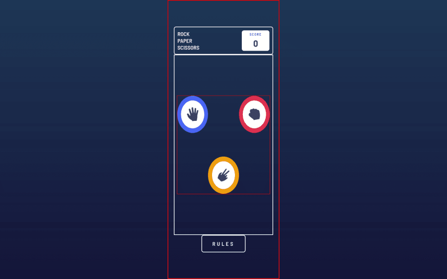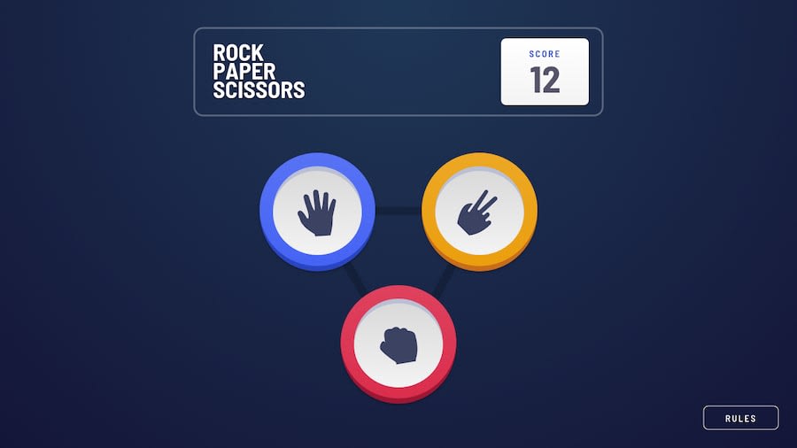
Design comparison
Solution retrospective
Hello everyone!
I know it may not be perfect, but i'm really proud of it!
I've could create a logic to the game, and after was able to implement it in code. And the result is very satisfying, in my opinion. I mean, you can cleary notice if you had won or lost, you can notice your and machine choice, and you can keep playing and playing and playing...
there is some issues in desktop layout, but that is cause i've used mobile first concept. I'm gonna fix it as soon as possible. But in mobile I guess it is fine!
I hope you enjoy it and I would appreciate to get some suggestions (especially about JS)
Regards!
Community feedback
- @hyrongennikePosted over 2 years ago
Hi @andykallian,
** nice job on completing the challenge**
Not much work to make it look good on desktop you just need to remove the red borders and add the following or change your media query.
@media screen and (min-width: 480px) {
.container {
    max-width: 800px;
}
}
Hope this is helpful.
0
Please log in to post a comment
Log in with GitHubJoin our Discord community
Join thousands of Frontend Mentor community members taking the challenges, sharing resources, helping each other, and chatting about all things front-end!
Join our Discord
