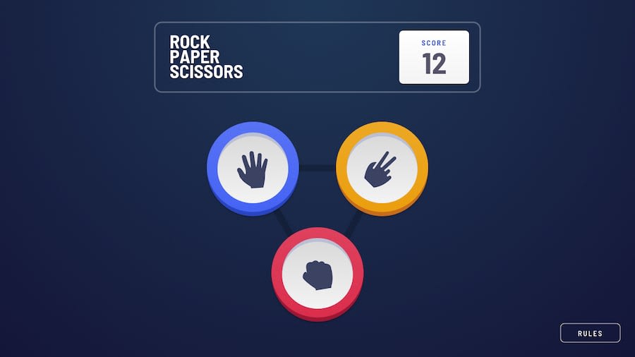
Design comparison
SolutionDesign
Solution retrospective
What are you most proud of, and what would you do differently next time?
Hey guys. I finally completed this challenge(really happy with the result). Play the game and comment your high scores 👇🏻
What specific areas of your project would you like help with?Though there are somethings that I wasn't able to accomplish:
- The 3rd circle ripple around the winner
- In the mobile layout rules page, I wasn't able to separate the close button and put it at the bottom. It would be great if someone can help me with these issues.
Community feedback
Please log in to post a comment
Log in with GitHubJoin our Discord community
Join thousands of Frontend Mentor community members taking the challenges, sharing resources, helping each other, and chatting about all things front-end!
Join our Discord
