Design comparison
SolutionDesign
Solution retrospective
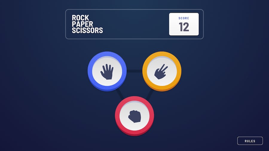
Hey Guys, I just finished the Rock, Paper, Scissors Game Challenge. I would like you all to see it and let me know how I can improve it. Let me know my mistakes. Thank you!.
Community feedback
- @grace-snowPosted almost 3 years ago
You're missing some important html semantics on this. Try and think of other html tags that are meaningful rather than text in spans and divs. Definitely some headings would help give this structure
Most important at all though is your easy/hard toggle is inaccessible at the moment. Instead use radio inputs so it is explicitly clear which state is being set at all times.
Good luck
Marked as helpful0 - @arkharman12Posted almost 3 years ago
- Scoreboard should not go in negative. Keep it at 0 if the player loses in the first game.
- Bottom half of the viewport is cut out at 1440px.
Marked as helpful0
Please log in to post a comment
Log in with GitHubJoin our Discord community
Join thousands of Frontend Mentor community members taking the challenges, sharing resources, helping each other, and chatting about all things front-end!
Join our Discord
