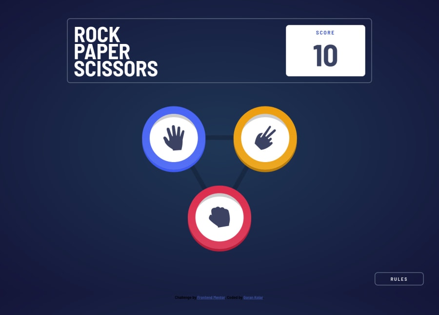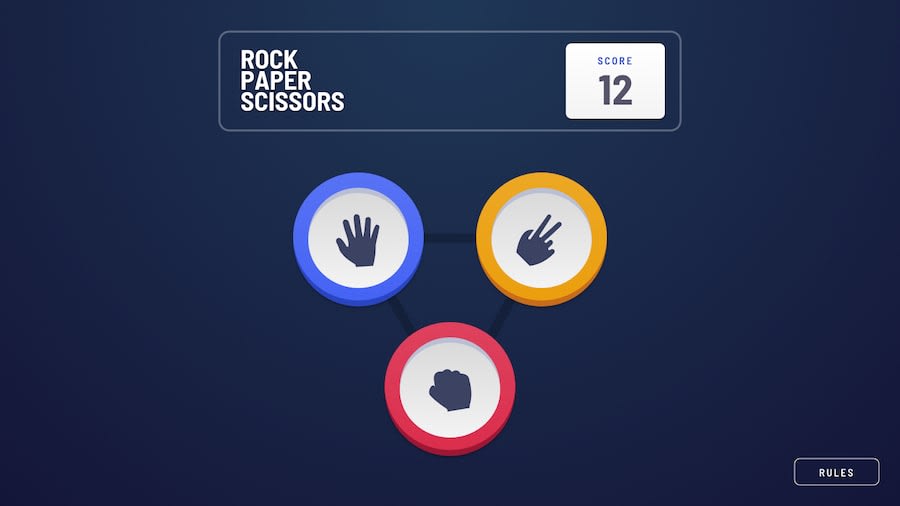
Design comparison
Solution retrospective
Hello, this is how I tackled this challenge.
I underestimated how much CSS this game would require, and I couldn't figure out how to add those expanding circles to the winner 🤔. The JS part was actually easier to figure out than the CSS 😵.
As always any advice is greatly appreciated.
Community feedback
- @Victor-NyagudiPosted over 2 years ago
Good job on this one. The game plays just as it should.
There are a couple of warnings in the HTML validation and accessibility reports you should take a look at.
For example, one of the warnings tells you your
<section>tags are missing anh2tag. All<section>tags should have one of these because it helps screen readers know what the section is about.If you don't want a title to appear or interfere with the layout, you can add an
h2tag and give it a class likefor-screen-readerthen add a meaningful title for that section.Next, style it such that it's not visible to people with good eyesight, however, screen readers will still read it out to those with poor vision for better context.
.for-screen-readers
{
     position: absolute;
     right: -1000000px; // give it a very large number so it's not visible
     height: 1px;
     width: 1px; // if it ever ends up on the screen, it's too small to be seen
     overflow: none;
}
To add those expanding circles to the winner, you could wrap their choice in
divand give it multiple box shadows.div.winner { box-shadow: 5px 5px white, 10px 10px grey, 15px 15px dark-grey; border-radius: 50%; }Hope this helps.
Good luck with your other solutions.
Marked as helpful0@GoranK89Posted over 2 years ago@Victor-Nyagudi Thank you for the advice and the expanding circles tip!
0
Please log in to post a comment
Log in with GitHubJoin our Discord community
Join thousands of Frontend Mentor community members taking the challenges, sharing resources, helping each other, and chatting about all things front-end!
Join our Discord
