Design comparison
SolutionDesign
Solution retrospective
What are you most proud of, and what would you do differently next time?
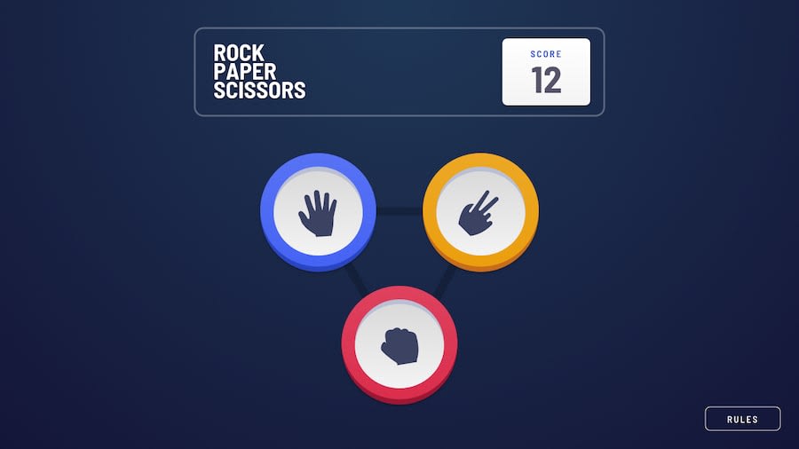
I've created an animated rock, paper, scissors game. Score is keeped when refreshing website. Clicking the logo toggles bonus game (rock, paper, scissors, spock, lizard). I would improve the layout next time. I've achieve the triangle and pentagon in a tricky way that i'm not really proud of. But, i tried my best and it works.
Community feedback
Please log in to post a comment
Log in with GitHubJoin our Discord community
Join thousands of Frontend Mentor community members taking the challenges, sharing resources, helping each other, and chatting about all things front-end!
Join our Discord
