Submitted 2 months ago
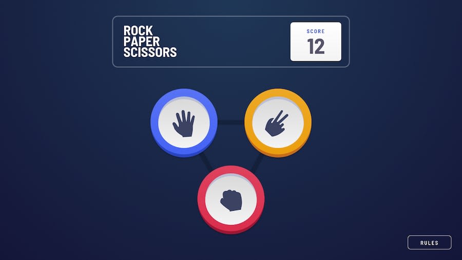
Rock, Paper, Scissors challenge with ReactJS
@ihemebiriegondu
Design comparison
SolutionDesign
Solution retrospective
What are you most proud of, and what would you do differently next time?
The smooth animations I implemented throughout the game and how I developed the game logic.
Community feedback
- @Sarah-okoloPosted 2 months ago
This looks really great👍. You might want to consider moving the content to the center. You can easily achieve this by adding
margin: 0 auto;at the top of both your.originalSectionandheadercode blocks. This should make everything look perfect. Great Job.0
Please log in to post a comment
Log in with GitHubJoin our Discord community
Join thousands of Frontend Mentor community members taking the challenges, sharing resources, helping each other, and chatting about all things front-end!
Join our Discord
