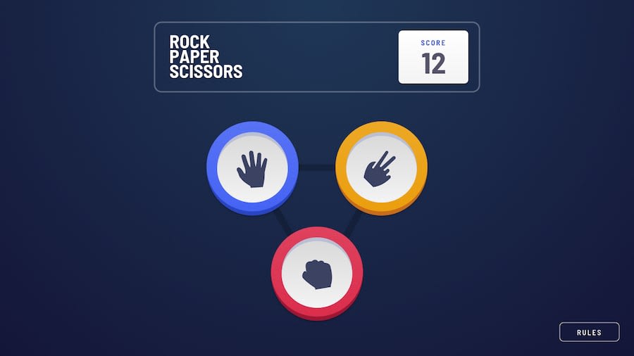
Design comparison
Solution retrospective
What I'm most proud of is the clean and responsive design I achieved using Tailwind CSS in my Rock, Paper, Scissors game. It was a great opportunity to hone my skills in both React and Tailwind, and I'm happy with how intuitive and visually appealing the final product turned out. Looking back, I would focus more on optimizing the code for scalability and performance. Additionally, I'd like to explore more advanced animations to enhance the user experience.
What challenges did you encounter, and how did you overcome them?One of the main challenges I encountered was managing state and logic within the React components, especially when it came to tracking the game's outcome and updating the scores. To overcome this, I utilized React's useState and useEffect hooks effectively, ensuring that the game state was properly updated and reflected in the UI. Additionally, I faced some difficulties in fine-tuning the responsiveness of certain elements, but with perseverance and experimentation, I was able to achieve a seamless experience across different screen sizes.
What specific areas of your project would you like help with?While I'm quite satisfied with the overall implementation of my project, I would appreciate some guidance on improving the accessibility of the game for users with disabilities. Specifically, I would like help in implementing keyboard navigation and ensuring that all interactive elements are properly labeled for screen readers. Any advice or resources on accessibility best practices would be invaluable in making my project more inclusive and user-friendly.
Community feedback
Please log in to post a comment
Log in with GitHubJoin our Discord community
Join thousands of Frontend Mentor community members taking the challenges, sharing resources, helping each other, and chatting about all things front-end!
Join our Discord
