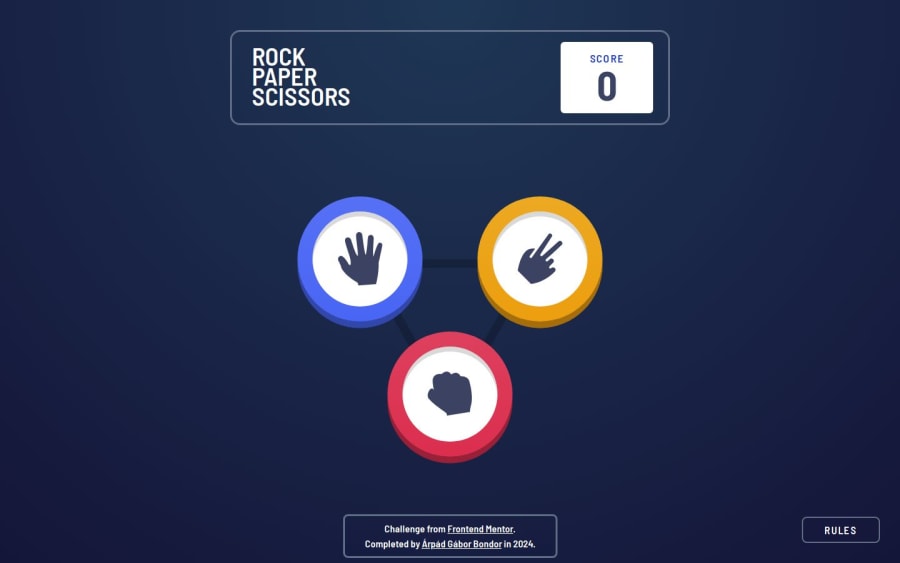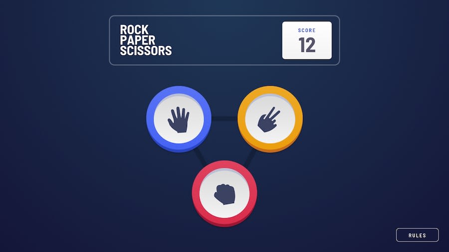
Rock Paper Scissors - Nuxt 3, Pinia, Tailwind
Design comparison
Solution retrospective
I made the positioning of every game component easier, by wrapping them in divs that allowed me to set the position of the middle of the components compared to the middle of the play area.
It might looks a bit clumsy, but it made much easier to set calculate the positions, and keep everything centered.
What challenges did you encounter, and how did you overcome them?I was aiming for creating a pure Tailwind design, but I encountered an error where Tailwind did not apply the shadows behind the disk components with the md: and the lg: modifiers added.
I even safelisted the classes in tailwind, so it didn't scrap the dinamically generated classnames at build time.
The classes themselves worked without the lg: modifiers, Tailwind just didn't apply them on wide screen..
Any feedback is welcome
Community feedback
Please log in to post a comment
Log in with GitHubJoin our Discord community
Join thousands of Frontend Mentor community members taking the challenges, sharing resources, helping each other, and chatting about all things front-end!
Join our Discord
