Rock Paper Scissor Lizard Spock with React.js and framer-motion
Design comparison
Solution retrospective
I am quite proud of the solution I found for the symbol comparison algorithm. My goal was to use as few IF ELSE statements as possible. I created an object that contains the symbols the player can choose as keys. Within each key there are two objects 'weakTo' and strongTo', which contain the respective symbols that either win or lose.
const items = {
			paper: { weakTo: ["lizard", "scissors"], strongTo: ["spock", "rock"] },
			rock: { weakTo: ["paper", "spock"], strongTo: ["scissors", "lizard"] },
			scissors: { weakTo: ["rock", "spock"], strongTo: ["paper", "lizard"] },
			spock: { weakTo: ["paper", "lizard"], strongTo: ["scissors", "rock"] },
			lizard: { weakTo: ["scissors", "rock"], strongTo: ["spock", "paper"] },
		};
The next step in the 'checkWinner' function is to compare the player's choice (P1) with the computer's choice and return the text for the modal.
if (items[p1].strongTo.find((el) => el === c1) === c1) {
			setScore(score + 1);
			return "You Win";
} else if (items[p1].weakTo.find((el) => el === c1) === c1) {
			return "You Lose";
} else {
			return "Tie";
		}
For instance, if the player selects 'paper', the first IF-check verifies if it is stronger than the computer's choice. We search the list using the 'find' method and check if it matches the computer's choice. If it matches, we win, if not, we jump to the next IF-check that verifies the weakness.
items[p1].strongTo.find((el) => el === c1) === c1
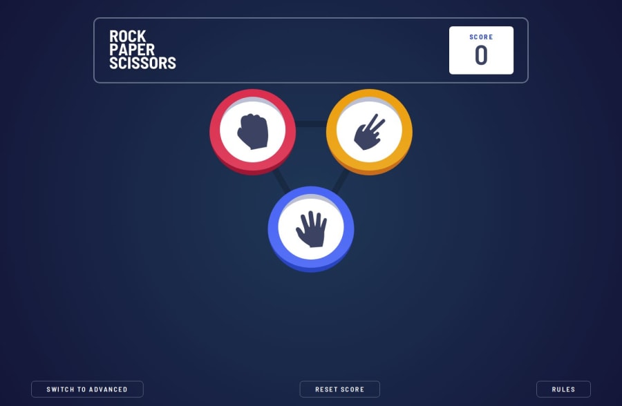
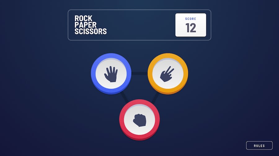
Currently, I am unhappy with the grid layout for 'Rock Paper Scissors Lizard Spock'. I can't position the lower symbols correctly.
Perhaps someone has an idea of how I can manage this.
Community feedback
Please log in to post a comment
Log in with GitHubJoin our Discord community
Join thousands of Frontend Mentor community members taking the challenges, sharing resources, helping each other, and chatting about all things front-end!
Join our Discord
