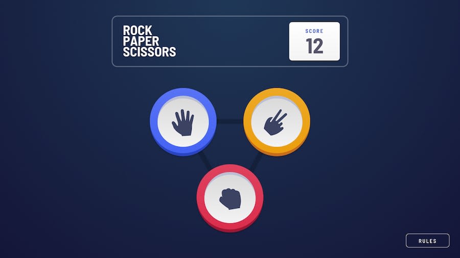
Design comparison
Solution retrospective
- adding image queue for house selection to simulate randomness
- using ripple effect on the ripple layout
- persisting the score on localStorage
for me, the main challenges for this challenge is actually the layout, not the game logic itself. i am quite unsatisfied with the ripple layout, the text for both house and player ,and the layout changes when the ripple layout appear
to overcome it, i use a lot of position:absolute, which is actually kinda bad because i have to micro manage the position of the text and the ripple.
there is also some flicker when the image changes which can be annoying
What specific areas of your project would you like help with?i use a lot of values inside the useContext, which works, but i feel it made my context bloated. i can split the values into multiple context, but i fear that it will make my main.tsx into context wrapper hell, and i also try to avoid using over complicated state management like redux for this simple project. how can i simplify the context without sacrificing code readability?
Community feedback
Please log in to post a comment
Log in with GitHubJoin our Discord community
Join thousands of Frontend Mentor community members taking the challenges, sharing resources, helping each other, and chatting about all things front-end!
Join our Discord
