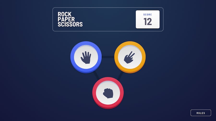
Design comparison
Solution retrospective
Feel free to say anything about the work.
Community feedback
- @shashreesamuelPosted over 2 years ago
Hey good job completing this challenge.
Keep up the good work
Your solution looks great however one of the circles are not circular like the rest secondly below the rules button is a lot of margin bottom. You should decrease it a little
I hope this helps
Cheers Happy coding 👍
Marked as helpful0@anilkoduruPosted over 2 years ago@TheCoderGuru In the solution page it looks like tha margin below rules is large ....but look at the website url it looks fine in that 🥲. If any changes to be done to rectify that you can suggest me. Have a good day.
0 - @paulpdoaPosted over 2 years ago
Hi! This is great! But I noticed that when it shows the result of the hands, the score doesn't change immediately.
In your code I also saw that there is so many if checks. Try making your code shorter and also try using Math.random() from javascript then create an array for which will contain the three hands for the computer. Then inside the function using the Math.random it will check which hand will be picked by the computer.
Well thats all, Happy Coding and keep improving!
Marked as helpful0@anilkoduruPosted over 2 years ago@paulpdoa Thanks for your reply, i will try to make js file smaller 😀. Have a great day.
0
Please log in to post a comment
Log in with GitHubJoin our Discord community
Join thousands of Frontend Mentor community members taking the challenges, sharing resources, helping each other, and chatting about all things front-end!
Join our Discord
