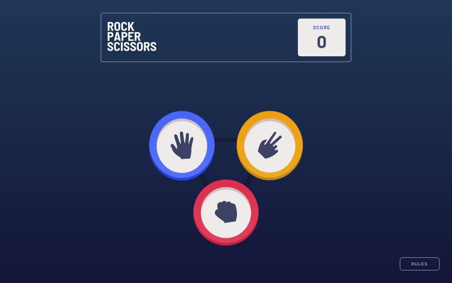


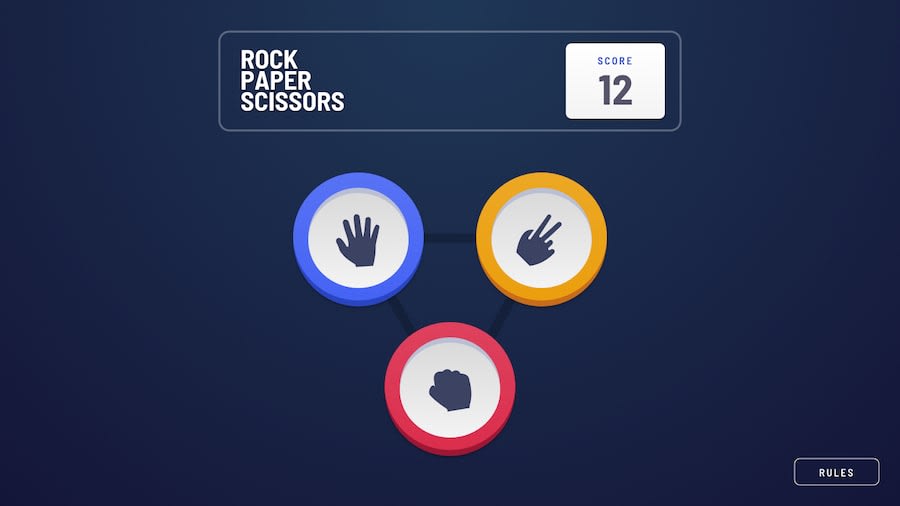
Design comparison
Solution retrospective
I didn't put the 'X' (close icon) in the right place on mobile size, I'm looking for an alternative option to make the design more accurate with the original one. I don't know how to do this 'wavy border effect' in the winning player and I don't know how to search for it, so if you know how to do it, please let me know! I used SASS to practice a little. I will study more to use the tool properly, like doing more mixings for example.
Community feedback
- @Dev-MV6Posted about 1 year ago
You can make the spotlight effect for the winner coin by using
radial-gradient()as the background of a pseudo-element, here's an example:.coin { position: absolute; left: 50%; top: 50%; transform: translate(-50%, -50%); width: 200px; height: 200px; background-color: #f00; border-radius: 100%; z-index: 1; } .coin::after { content: ''; position: absolute; top: 50%; left: 50%; height: 260%; width: 260%; background: radial-gradient(circle, hsla(0,0%,100%,.08) 40%, hsla(0,0%,100%,.04) 40%, hsla(0,0%,100%,.04) 55%, hsla(0,0%,100%,.02) 55% ); border-radius: 100%; transform: translate(-50%,-50%); transform-origin: 0 0; /* Useful when animating with scale() */ z-index: -1; }You can learn more about hard stop gradients on: https://css-tricks.com/books/greatest-css-tricks/hard-stop-gradients/
Hope you find this useful 👍
Marked as helpful1@AkamineFabioPosted about 1 year ago@Dev-MV6 Thank you so much! Really appreciate it! I'll update it later!
0

Please log in to post a comment
Log in with GitHub
Join our Discord community
Join thousands of Frontend Mentor community members taking the challenges, sharing resources, helping each other, and chatting about all things front-end!
Join our Discord