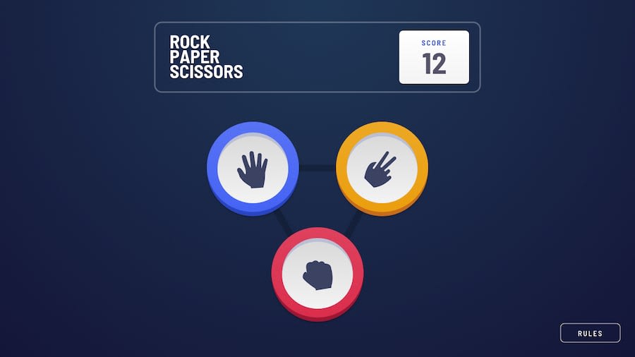
Design comparison
Solution retrospective
Feedback me if you have any suggestion and If you like this project please give me star on github
Community feedback
- Account deleted
Hey, great work on this one. The desktop view is good (except for the missing rules modal window), but there are some problems with the tablet and mobile. Your site isn't adaptive at all, try to press
F12in (google chrome, or open it with the right mouse click) and open developer tools. Try to play with screen size on the top, and see how your site looks at other devices.Accessibility. You added onclick event handler on your
imgtags, and that's a problem. Try to control your site using only the keyboard, by pressingTab. You'll see that you can't press the buttons at all. Wrap yourimgtags into HTML semantic tagbutton, and add an event listener on that button, not on img. That will make your site more accessible, and users will be able to use screen readers on your site. (In addition, you can addaria-labelattributes on your buttons, for example, the paper button must havearia-label="Paper"etc.). So in the future use suitable HTML semantic tags in the same situations.I saw, that you made your buttons with img. So I highly do not recommend making that. Instead of this use default CSS properties. That will give you more control over your buttons, and if you need to change something, for example, the colour of the button, you can easily do it in CSS without changing the picture. Check up that CodePen that I made. (That snippet of my solution, if you're interested in the whole site, check-up that link)
The first thing that you need to fix is to make your site looks good on all devices. After that, you can think about accessibility. Summarizing the desktop version in general looks good (please centre
Play againbutton, it's so annoying perfectionism) but the mobile version must be fixed. So I see that you're a newbie so there are things that you need to learn (semantic tags, accessibility). And try to realize things using only CSS, it's really good practice, try not to avoid them by using images. I hope that you find that feedback useful, thanks for your attention.0
Please log in to post a comment
Log in with GitHubJoin our Discord community
Join thousands of Frontend Mentor community members taking the challenges, sharing resources, helping each other, and chatting about all things front-end!
Join our Discord
