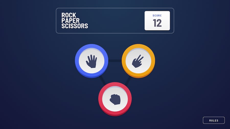
Rock, Paper and Scissors Page - React, Redux TK and Sass
Design comparison
Solution retrospective
Hi everyone!! Well this page was a completely challenge for me and even more because I tried to learn more than one tool (Sass and Redux) that made the project took more time than I expected. But was so funny, learned so much with this project and really challenged my skills. The thing that took me more time was the styles. I still had some issues that I did not know how to solve, like the last box shadow in bigger devices that is not completely rounded and also I did not know how to save the points obtained when refresh the page, something that I think I should use backend things or something that I didn't study yet. But I hope you like it and please let me know any suggestion that you have.
Community feedback
Please log in to post a comment
Log in with GitHubJoin our Discord community
Join thousands of Frontend Mentor community members taking the challenges, sharing resources, helping each other, and chatting about all things front-end!
Join our Discord
