Design comparison
Solution retrospective
Kindly leave a feedback. Thanks
Community feedback
- @webguy83Posted over 2 years ago
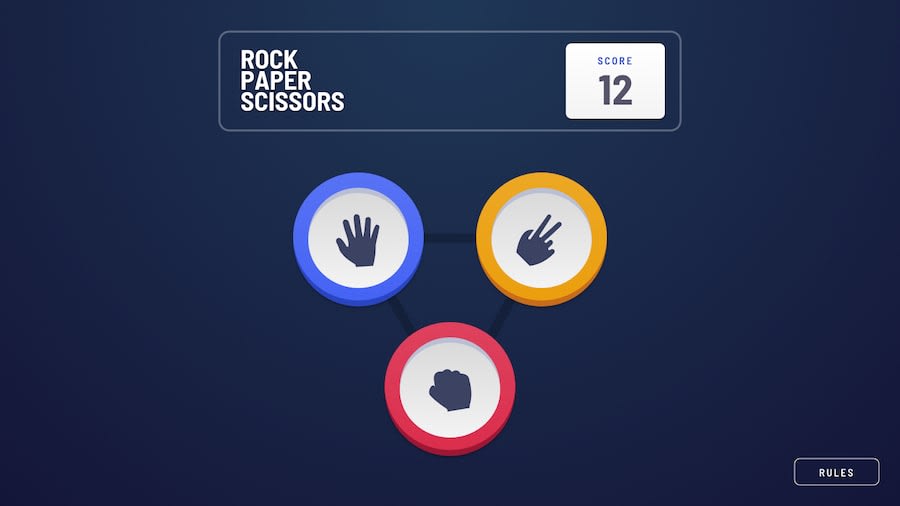
When I run through your application a few times I have to hit the back button so many times. I would try to make this more of a single page application. Not a fan of the timer number although just my opinion :). Anyways if you keep it you will need to hide the Play Again button while you're in the timer state as the use can hit Play Again without finishing the result. Your icons are a bit chopped off too!
Marked as helpful0 - @wanlucasPosted over 2 years ago
helo, @devZibah! I have a few things to mention that you could improve:
the figures inside the buttons are slightly cropped.
the header is too big compared to the order.
the gap between the bottoes is a bit exaggerated.
I think adding small animations could make the project more friendly.
you're doing great, just need to fix a few things, I recommend taking a look at my project to get some guidance on animations.
0@DevZibahPosted over 2 years ago@wanlucas Thank you!! I'll take a look at your project.
0
Please log in to post a comment
Log in with GitHubJoin our Discord community
Join thousands of Frontend Mentor community members taking the challenges, sharing resources, helping each other, and chatting about all things front-end!
Join our Discord
