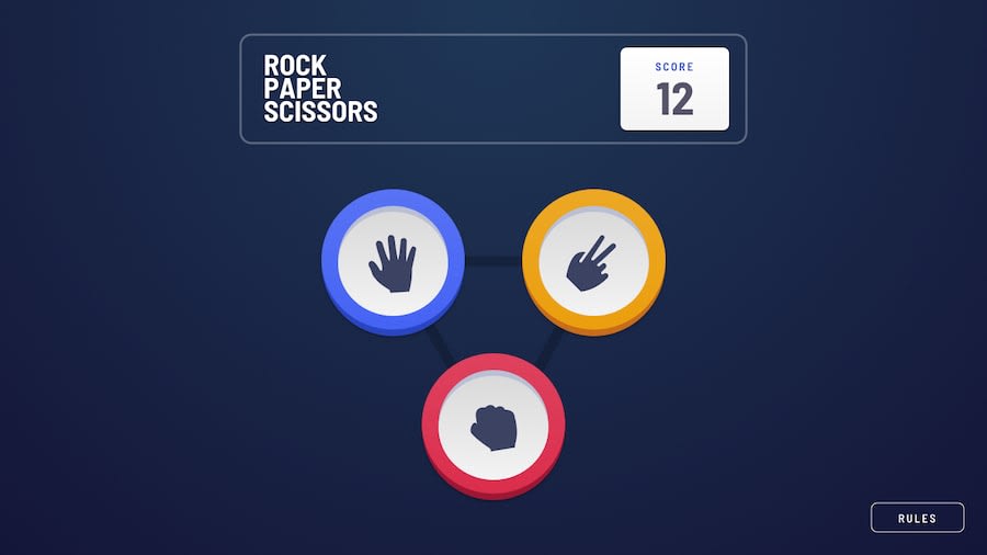
Design comparison
Solution retrospective
I'm most proud of how I was able to implement the game logic and ensure all the rules were followed correctly. The scoring system was also a significant part of the project, and I'm pleased with how the game keeps track of results and provides clear feedback to the user. Furthermore, I was able to implement an intuitive and responsive interface that improves the user experience. Next time, I would focus on adding more features to make the game more engaging and challenging, such as adding difficulty levels or additional game modes. I would also invest more time in optimizing the code and improving the user experience, perhaps with better animation and visual feedback. Additionally, I would like to explore the possibility of adding functionality to play against artificial intelligence, which would require a different approach to game logic.
What challenges did you encounter, and how did you overcome them?Game Logic and Rules:
Challenge: Implementing the logic to determine the winner based on the rules of the game (rock beats scissors, scissors beats paper, and paper beats rock) was challenging. Keeping the logic clear and error-free was crucial. Solution: I created a dedicated function to determine the winner, using a clear conditional structure. I tested extensively with different inputs to ensure all rules were applied correctly. User Interface and Experience:
Challenge: Make the user interface intuitive and responsive, ensuring interactions were fluid across different devices and screen sizes. Solution: I used responsive design techniques and CSS frameworks to ensure the game adapted well to different screen sizes. I added visual feedback and animations to improve the user experience and make the game more immersive. Status and Score Management:
Challenge: Keeping track of game state and scoring throughout matches, especially when dealing with multiple games and restarts. Solution: Implemented a state management framework using global variables and functions to update and display the score. I tested restarting the game to ensure the score and state were reset correctly. User Interaction and Feedback:
Challenge: Ensure user messages and feedback were clear and useful, especially when displaying results and scores. Solution: I used clear, simple messaging to display match results and updated the user interface with immediate feedback on each play. I added a messaging system that guides the user about what is happening in the game.
Community feedback
Please log in to post a comment
Log in with GitHubJoin our Discord community
Join thousands of Frontend Mentor community members taking the challenges, sharing resources, helping each other, and chatting about all things front-end!
Join our Discord
