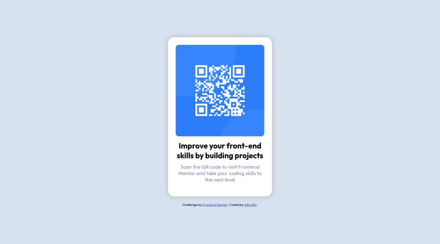
RFIX_Solution_QR-Component-Front-end-mentor
Design comparison
Solution retrospective
Hi everyone!👋🏻
Really enjoyed making this project!
Let me know how can I improve!
Thanks!
Community feedback
- @NaveenGumastePosted about 3 years ago
Hay ! Raul Pinero Good Job on challenge
These below mentioned tricks will help you remove any Accessibility Issues
-> Add Main tag after body
<main class="container"></main>-> Learn more on accessibility issues
If this comment helps you then pls mark it as helpful!
Have a good day and keep coding 👍!
Marked as helpful0@RPinero-20Posted about 3 years ago@Crazimonk Hi! thank you very much for the advice! i´ll keep in mind next time, and next, and next, and ... 😁 forever
1 - @YazdunPosted about 3 years ago
Hey Raul great job on this, to get rid of accessibility issue, you must add a
h1heading to yourmaintag which tells what this page is about, it can be hidden, you can use a simplesr-onlycss class if you want to make it hidden.right now, as your website hits around
337pxwidth, QR card sticks to the edge of the screen which is not the best user experience IMO, so make sure to use some paddings on QR code's parent element.in my opinion your
box shadowis too thick, but hey, that's a personal opinion 😁well done and keep coding !
Marked as helpful0 - @EmmanuelHexerPosted about 3 years ago
Great job overall man.
0
Please log in to post a comment
Log in with GitHubJoin our Discord community
Join thousands of Frontend Mentor community members taking the challenges, sharing resources, helping each other, and chatting about all things front-end!
Join our Discord
