

Design comparison

Please log in to post a comment
Log in with GitHubCommunity feedback
- P@Stroudy
Exceptional work! You’re showing great skill here. I’ve got a couple of minor suggestions that could make this stand out even more…
-
Using a
<main>tag inside the<body>of your HTML is a best practice because it clearly identifies the main content of your page. This helps with accessibility and improves how search engines understand your content. -
Your heading elements
<h1><h3>Missing h2, Heading elements should be in sequentially-descending order (e.g.,<h1>,<h2>,<h3>) to create a clear content structure, improving accessibility and SEO. Skipping levels or using them out of order can confuse screen readers, affect search engine rankings, and make your content harder to understand.
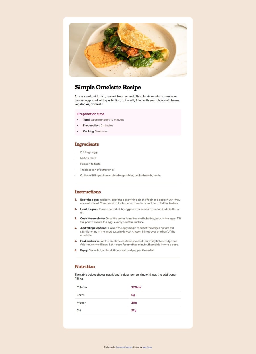
<h1>Simple Omelette Recipe</h1> <h3>Preparation time</h3>-
Using a full modern CSS reset is beneficial because it removes default browser styling, creating a consistent starting point for your design across all browsers. It helps avoid unexpected layout issues and makes your styles more predictable, ensuring a uniform appearance on different devices and platforms, check out this site for a Full modern reset
-
Using
font-display: swapin your@font-facerule improves performance by showing fallback text until the custom font loads, preventing a blank screen (flash of invisible text). The downside is a brief flash when the font switches, but it’s usually better than waiting for text to appear. -
Using
remoremunits in@mediaqueries is better thanpxbecause they are relative units that adapt to user settings, like their preferred font size. This makes your design more responsive and accessible, ensuring it looks good on different devices and respects user preferences.
@media screen and (min-width: 1024px)- While
pxis useful for precise, fixed sizing, such asborder-width,border-radius,inline-padding, and<img>sizes, it has limitations. Pixels don't scale well with user settings or adapt to different devices, which can negatively impact accessibility and responsiveness. For example, usingpxfor font sizes can make text harder to read on some screens, Check this article why font-size must NEVER be in pixels. In contrast, relative units likeremand adjust based on the user’s preferences and device settings, making your design more flexible and accessible. Usepxwhere exact sizing is needed, but prefer relative units for scalable layouts. If you want a deeper explanation watch this video by Kevin Powell CSS em and rem explained. Another great resource I found useful is this px to rem converter based on the default font-size of 16 pixel.
I hope you’re finding this guidance useful! Keep refining your skills and tackling new challenges with confidence. You’re making great progress—stay motivated and keep coding with enthusiasm! 💻
-

Join our Discord community
Join thousands of Frontend Mentor community members taking the challenges, sharing resources, helping each other, and chatting about all things front-end!
Join our Discord