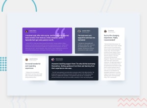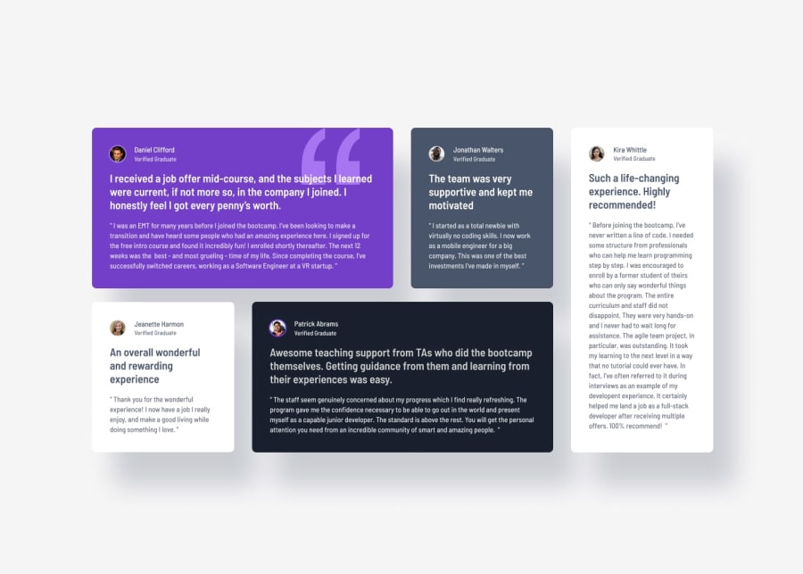
Design comparison
SolutionDesign
Community feedback
- P@MattPahutaPosted 7 months ago
Hey there. Nicely done completing this challenge. Your solution is a close match to the design comp and you're effectively using semantic html elements as well as CSS custom properties. That said, there are a few things I'd recommend revisiting to improve your project:
- Get in the habit of including a modern CSS reset at the start of the styles. Andy Bell and Josh Comeau both have excellent resets you can google and use.
- There's no need to set a height on the body. This should be avoided. Instead, set a min-height of 100vh or 100svh on the body.
- The person's name should be a heading for each card instead of a p element. And as this is a component that's meant to live among other components on a page, you should make those h2's.
- Your styles and media queries are set up for larger screens first, then adjusted for smaller devices. This should be reversed. Build the layout from a mobile-first perspective and then use media queries with a min-width (and rem units) to account for the larger screens. You'll end up with cleaner css code and less you'll need to apply within the media queries. For instance, your grid container only needs a
display: gridandgapby default. You'd then adjust the grid layout to your liking as the screen expands. - Use rem units for font sizes instead of pixels. Also, It would be preferable to apply the font size on the body rather than the root. You could still define a variable for font size in root and use that as the value you assign to the body.
- Avoid using percentages with the width property. You have this set in several areas of your code and it's likely been a headache to get everything positioned properly. When dealing with widths, it's best to stick with max-width and/or min-width along with responsive units (rems or ems). The same goes for height properties.
- On the largest screen sizes, your design is stretching much wider than it ought to. Again, you'll want to adjust how you're setting your widths on the grid container and in other areas to fix this.
- The quotation image is purely decorative and should have empty alt attributes (
alt=""). Also, the alt attributes for the user avatars should be a bit more descriptive. There are some good posts on writing good alt descriptions over on the discord sever in the resources channel. - Back to the quotation image. I see you're using opacity to allow for the text to be visible but it's still partially obscuring the text. Use z-index to move it back in the stack or you could try applying the image as a background image and play around with the background positioning.
Again, well done completing the challenge, and good luck moving forward.
Marked as helpful0
Please log in to post a comment
Log in with GitHubJoin our Discord community
Join thousands of Frontend Mentor community members taking the challenges, sharing resources, helping each other, and chatting about all things front-end!
Join our Discord
