Design comparison
SolutionDesign
Solution retrospective
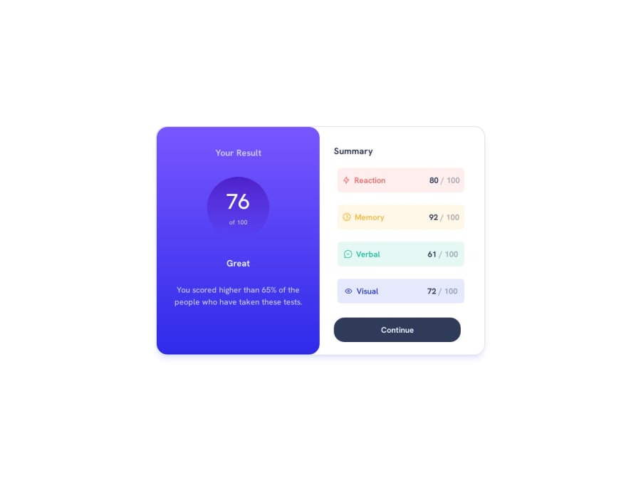
please let me know if i need to change something.
Community feedback
- @RafaRoque29Posted over 1 year ago
Great desgin my friend ! What I do to center the card is this, maybe you can try next time to see if that works for you.. .container{ display: flex; height: 100vh; align-items: center; justify-content: center; } And that will take your card right to the center of the page, you can try to use the fonts they suggest to have your design similar to the challenge
Marked as helpful0 - @oubrikyoussefPosted over 1 year ago
Very Good try to center it in page and fix font weights
Marked as helpful0
Please log in to post a comment
Log in with GitHubJoin our Discord community
Join thousands of Frontend Mentor community members taking the challenges, sharing resources, helping each other, and chatting about all things front-end!
Join our Discord
