Design comparison
SolutionDesign
Community feedback
- @mohamed-magdy26Posted over 1 year ago
Hello there 👋. Good job on completing the challenge !. here are some suggestions:
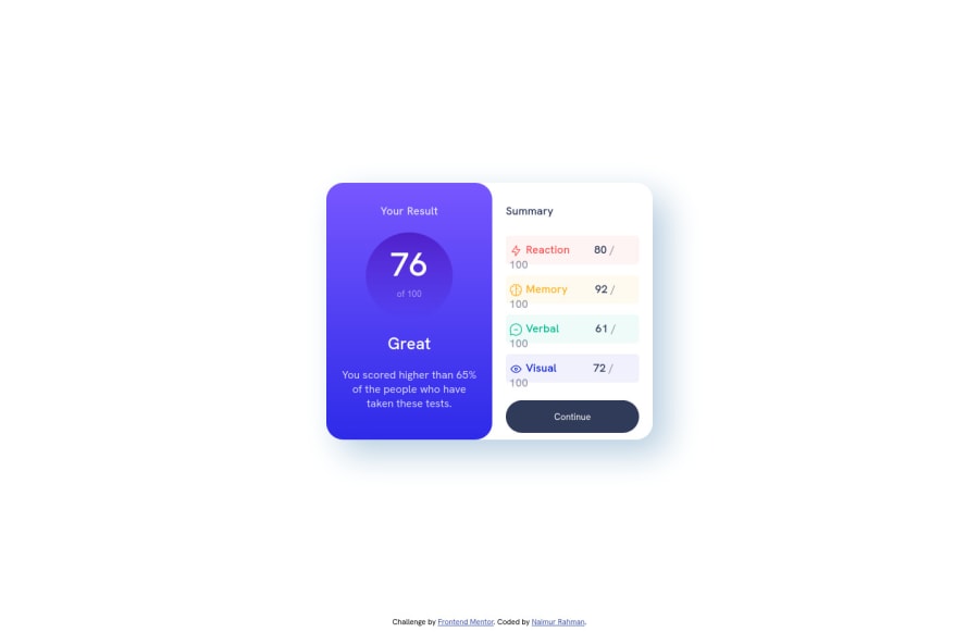
- remove the height of the ".content" element
- add padding-top and padding-bottom for both sections ".result" and ".summary"
Marked as helpful1 - @nymr-05Posted over 1 year ago
I don't know why the continue button is showing like this. It doesn't show like this in my browser.
0
Please log in to post a comment
Log in with GitHubJoin our Discord community
Join thousands of Frontend Mentor community members taking the challenges, sharing resources, helping each other, and chatting about all things front-end!
Join our Discord
