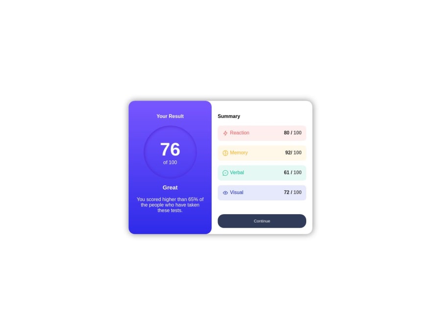
Design comparison
SolutionDesign
Solution retrospective
All feedback are welcomed
Community feedback
- @barcacaPosted 12 months ago
Hello, Great job on the challenge!
I have some feedback to share.
- I suggest switching the
margin-toptomargin-blockfor thebuttontag. This would create space at the top and bottom, improving the mobile layout. - Also, adding the hover effect using this CSS code, will create an appealing effect on the
button.
button:hover {
  background: linear-gradient(hsl(252, 100%, 67%), hsl(241, 81%, 54%));
}
Keep up the good work!
0 - I suggest switching the
Please log in to post a comment
Log in with GitHubJoin our Discord community
Join thousands of Frontend Mentor community members taking the challenges, sharing resources, helping each other, and chatting about all things front-end!
Join our Discord
