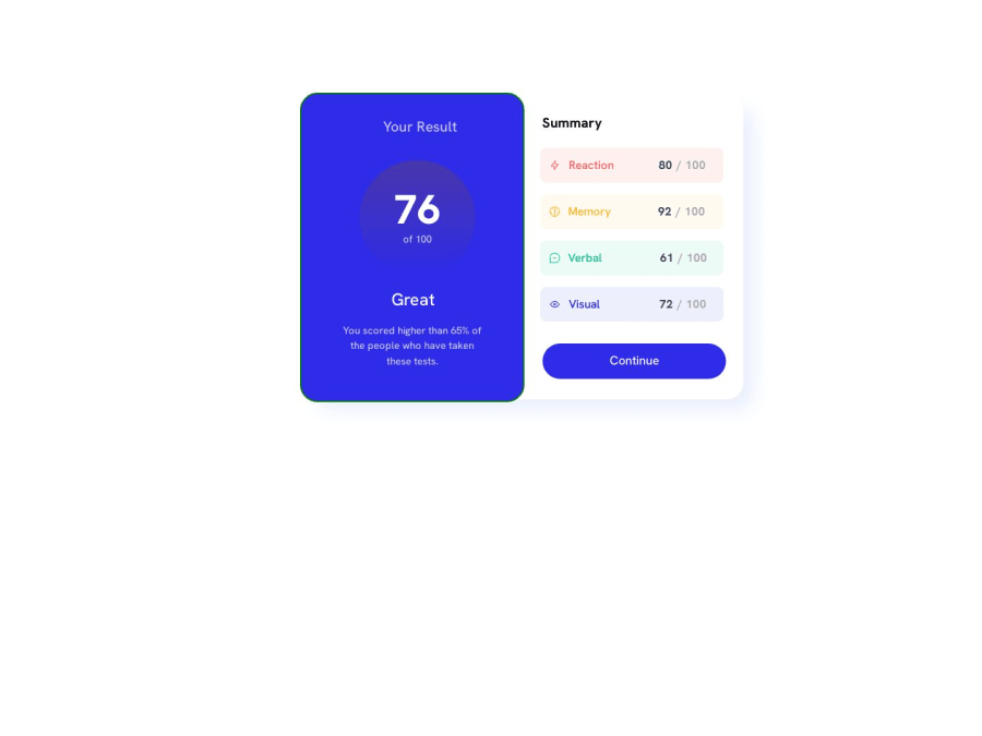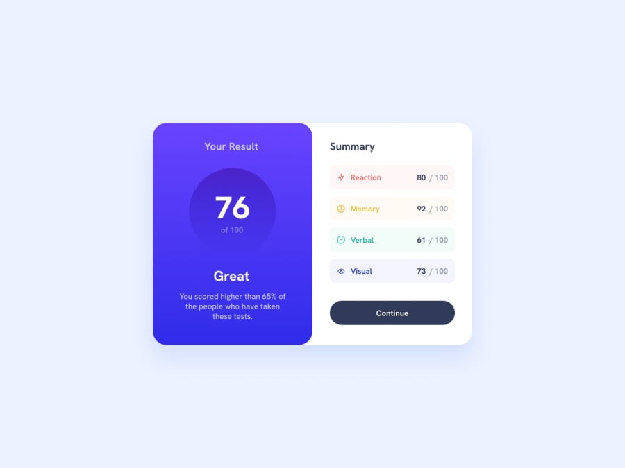
Design comparison
Solution retrospective
Please help me how can I more proficiently and easily can write my code because I have written somethings in more complicated way, which can be done with simple lines of code. So kindly help me and give as much feedback as possible.
Community feedback
- P@danielmrz-devPosted over 1 year ago
Hello @Exquisite10!
Your project looks great!
I noticed that you used
positionto place your card closer to the middle of the page, but when the screen size changes, the card loses its position. I have a few suggestions on how you can fix that:-
First, you tried to center the
div.outer, but you should've tried to center thediv.most-outer -
Second, here are two ways to center elements, no matter the size of the screen:
You can apply this to the body (in order to work properly, you can't use position or margins):
body {
    height: 100vh;
    display: flex;
    justify-content: center;
    align-items: center;
}
Or you can apply this to the element you wanna center:
.element { position: absolute; top: 50%; left: 50%; transform: translate(-50%, -50%); }- And third, in order to make your HTML more semantic, the main content should be wrapped with the tag
main. This helps with accessibility too.
I hope it helps!
Other those details, you did an excelent job!
0 -
Please log in to post a comment
Log in with GitHubJoin our Discord community
Join thousands of Frontend Mentor community members taking the challenges, sharing resources, helping each other, and chatting about all things front-end!
Join our Discord
