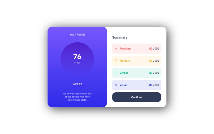
Design comparison
SolutionDesign
Community feedback
- @0xabdulkhaliqPosted over 1 year ago
Hello there 👋. Congratulations on successfully completing the challenge! 🎉
- I have other recommendations regarding your code that I believe will be of great interest to you.
CSS 🎨:
- We don't want to use
absoluteposition to center the component both horizontally & vertically. Because usingabsolutepositioning will break normal flow of a page
- To properly center the component in the page, you should use
FlexboxorGridlayout. You can read more about centering in CSS here 📙.
- For this demonstration we use css
gridto center the component
body { min-height: 100vh; display: grid; place-items: center; margin: 0; }- You can remove the style rules,
.main-container {
  position: absolute;
  top: 50%;
  left: 50%;
  transform: translate(-50%, -50%);
}
I hope you find it helpful! 😄 Above all, the solution you submitted is great !
Happy coding!
Marked as helpful0@JulianGibelliPosted over 1 year ago@0xAbdulKhalid Thanks a lot for your answer! I gonna definetly use that from now on!
0
Please log in to post a comment
Log in with GitHubJoin our Discord community
Join thousands of Frontend Mentor community members taking the challenges, sharing resources, helping each other, and chatting about all things front-end!
Join our Discord
