Design comparison
SolutionDesign
Please log in to post a comment
Log in with GitHubCommunity feedback
- @romyanand
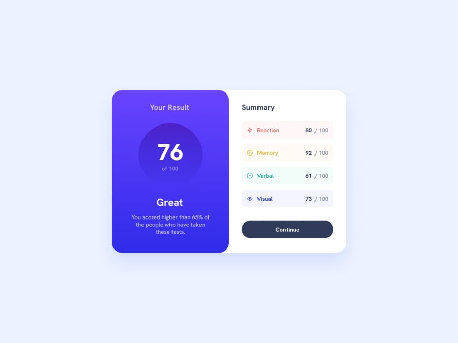
Hey Juan, as per the design provided in the challenge, you can put "Summary", "button" and all the brief results below it in a container. Also, it would be better if the right side of the card also had some border-radius. Everything else looks great. Congratulations on completing the challenge.
Join our Discord community
Join thousands of Frontend Mentor community members taking the challenges, sharing resources, helping each other, and chatting about all things front-end!
Join our Discord
