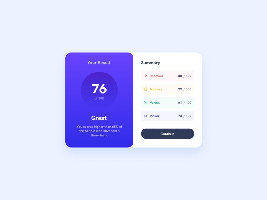
Design comparison
SolutionDesign
Solution retrospective
I am so glad I completed this challenge. Initially, before I started it, I had this sentiment that already knew how to center a div very well but I was wrong. I struggled with it until I came up with the solution... body { min-height: 100vh; display: grid; place-content: center; } Please feel free to drop any other solution on how to center a div. I will highly appreciate it.
Please log in to post a comment
Log in with GitHubCommunity feedback
No feedback yet. Be the first to give feedback on Steve's solution.
Join our Discord community
Join thousands of Frontend Mentor community members taking the challenges, sharing resources, helping each other, and chatting about all things front-end!
Join our Discord
