Design comparison
SolutionDesign
Community feedback
- @JoshuaMeeksPosted about 2 years ago
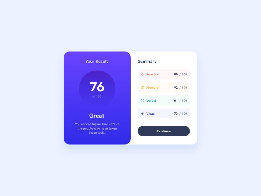
You could try adding a box shadow to the component and also the container background colors in your summary are just translucent versions of your words (Reaction, Memory, etc.) You could use hsla or rgba to achieve this.
0
Please log in to post a comment
Log in with GitHubJoin our Discord community
Join thousands of Frontend Mentor community members taking the challenges, sharing resources, helping each other, and chatting about all things front-end!
Join our Discord
