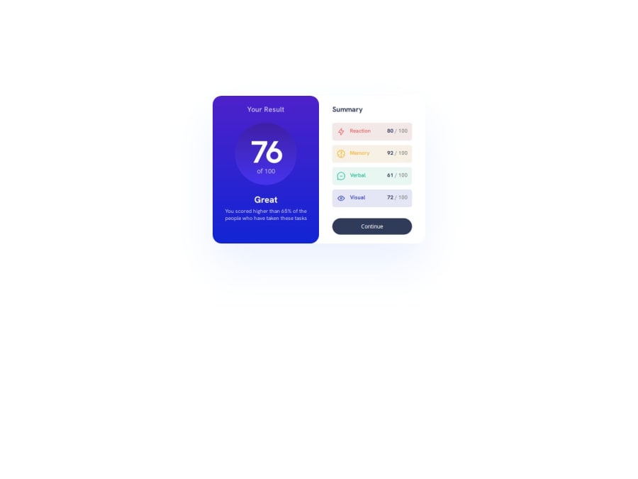
Design comparison
SolutionDesign
Community feedback
- @MH-RashidPosted 6 months ago
Great work, buddy. Colours are matching closely to the design and you've made good use of flexbox.
Suggestions
- Responsive design (1) Transition to mobile view sooner, ideally once the window reaches the vertical edges of the card in desktop view. The 375px they mention is just the viewport width at which they made the design screenshots, and it serves as a guide for design at that width not necessarily for responsive styling (2) Incorporate min-height condition so that you transition to mobile view once the window height shrinks to the height of the card in desktop view
- "of 100" is not using the correct font style
- Make use of transparency to fade out the score bubble towards its bottom
- Centre the card on the page. Set the height of html to 100%. Convert "body" to a CSS grid or flexbox and make use of the respective positioning properties to centre the card vertically and horizontally. Alternatively, define specific width and height of the card and set its margins to auto and inset to 0 and position to absolute
- There are some redundant margin 0 and padding 0 since you already set these properties at the start when resetting your css
- You don’t need another flexbox for .item-container. Just set a margin for either the icon or text to create the gap
Please mark this comment as helpful if it helped you out 👍 😄
0
Please log in to post a comment
Log in with GitHubJoin our Discord community
Join thousands of Frontend Mentor community members taking the challenges, sharing resources, helping each other, and chatting about all things front-end!
Join our Discord
