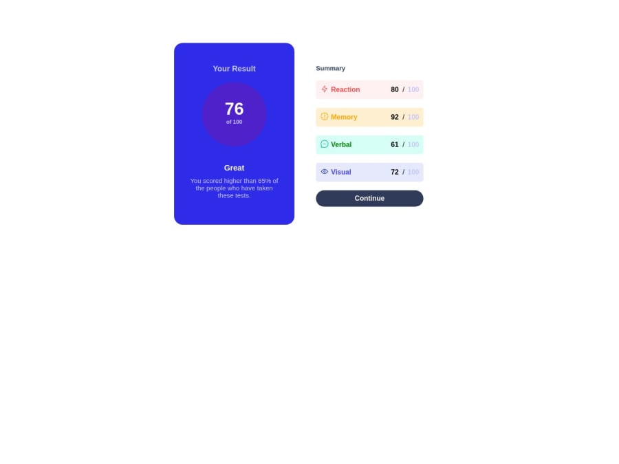
Results-Summary-Component. Responsive for only mobile and desktop.


Design comparison

Solution retrospective
Challenges I faced:
- Found it extremely difficult in the beginning stages to wrap the icons with the name of the result(Memory, Vision, etc).
- I built it mobile first and it may have eased a few of the processes to make it desktop responsive, but I still faced challenges such as the padding around the new view. Areas I am Unsure of:
- I feel the spanning is a tad bit too much and could be refactored to something neater and less spaghetti code.
- Responsive view is alright, but could be better.
Questions:
- Tips for responsive design.
- How to write clean code.
Community feedback
- @adityaphasuPosted over 1 year ago
Hello, @KingLyrics!
Regarding CSS, some few fixes to reduce unnecessary code:
- Instead of using margin (
margin: 100px auto) to center the main.containeron desktop screens use flex/grid on body using media query to center the card like this:
//under the media query body { display: grid; min-height: 100vh; place-items: center; }- This will center the card in the middle of the page without using margin and the
min-heightwill make sure that it stays in the center even if viewed from landscape modes. - After doing this you can remove the margin from the container.
Now coming on to the removing and refactoring code:
- There's actually a shorthands for writing top, right, bottom and left paddings/margins instead of writing those separately like in this example:
padding: 20px 30px 40px 50px
     //top   //right    //bottom  //left
or if you only want to give (top and bottom) or (left and right) it can be done like this:
padding: 20px 0;
//top and bottom   // left and right
Here give the docs a read as there are more shorthand of writing it. (You can do the same for margins as well)
- We are going to remove all the
marginandmax-width: 320px;from the.summaryas it limits the responsiveness of the.summaryinstead of this we are going to add the padding to the.summaryin general and that way you won't have to add the padding in the media query like this:
.summary { padding: 45px 30px 0px 33px; remove the ones below /* max-width: 320px; */ /* margin-left: 20px; */ /* margin-right: 20px; */ /* margin-top: 20px; */- See how I have used the shorthand for the paddings? writing it this way saves writing the individual padding in 3-4 separate lines. After adding the padding here you can remove the paddings from the
media-queryand the.summarywill look good on any device. - In the
.topdropdiv you can actually also remove the margins on.titleand.notificationsand make use of thegapproperty offered when flex/grid is used and since the topdrop div is already flexed you can just add thegapproperty to it and as the name says it adds a gap between the items you can do it like this:
.topdrop{ background-color: var(--Lightroyalblue); display: flex; justify-content: center; align-items: center; flex-direction: column; gap: 20px; // This here }- After adding gap you can remove all the margin bottoms and tops from the child elements of
.topdrop! less code yay!
Now coming onto the Html part:
- Instead of using
divas a button, use the actual<button>like this:
<button class="btn">
         Continue
</button>
Now regarding the semantics:
- Only use one
h1heading per page which means you can make thesummarytext ah2heading instead. Why? because generally theh1represents the main theme of your page to the search engines and if there are two then it will be confusing. - Instead of using a
divfor the whole container, try using a more semantic tag like<main>which tells the search engines and assistive tech what the main content of the page is. You just gotta remove the div and add the main like this:
<main class="container"
  //rest of the stuff
</main>
For responsiveness:
- Try using
rem/emunits for font-size rather thanpxunits because px are absolute units and they stay the same whilerem or emare relative units and they scale well with the layout. I have usedpxin this feedback so that it doesn't seem something new and harder to understand and intentionally saved this part for the last so that you can learn it at your own pace.Here you can read a lot more about it in detail.
and lastly, good job on completing the challenge!!
Good luck on your future endeavors and happy coding!!🙌🏻🙌🏻
1@KingLyricsPosted over 1 year ago@adityaphasu Thank you so much! Will implement the changes and also will work on the tips you have give. Really appreciate it! Good luck on your future endeavors!
1 - Instead of using margin (

Please log in to post a comment
Log in with GitHub
Join our Discord community
Join thousands of Frontend Mentor community members taking the challenges, sharing resources, helping each other, and chatting about all things front-end!
Join our Discord