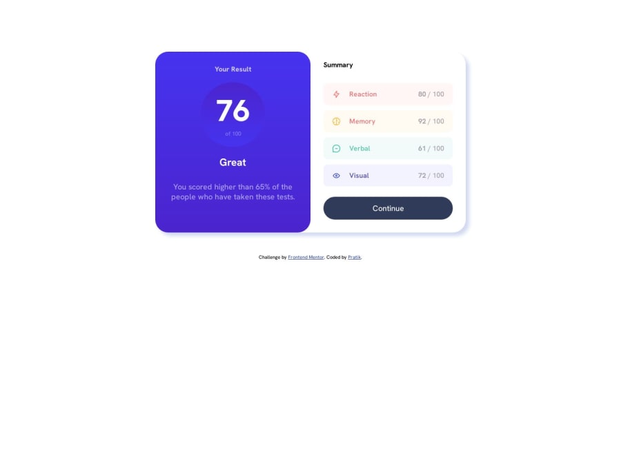
Design comparison
Solution retrospective
This was a pretty good challenge for me. Any feedback is greatly appreciated in order for me to improve my skills, thank you in advance🫡.
Community feedback
- @Al-lienPosted about 1 year ago
First of all, pardon my English, it’s not my native langage. Here’s my advices :
-
Get rid of not necessary files in your repository (readme template, etc…)
-
use semantic elements (<article>, <section>, etc…) instead of <div> as they clearly defines their contents.
I would recommand this website if you want to know more about semantic elements .
- Finally, since you used relative values for .container, when you reduce the size of your page everything moves and it’s not pretty. Try using an absolute value for your container like px. Then you can change it with media queries when you feel the need to.
Otherwise it’s great work ! See ya !
Marked as helpful1@itspratikpatil2001Posted about 1 year ago@Al-lien Thank you for your valuable advice! I appreciate your suggestions for cleaning up unnecessary files, using semantic elements, and using absolute values for containers. Your feedback will help me improve my project. If you have any more tips or questions, feel free to ask. Have a fantastic day!
1 -
Please log in to post a comment
Log in with GitHubJoin our Discord community
Join thousands of Frontend Mentor community members taking the challenges, sharing resources, helping each other, and chatting about all things front-end!
Join our Discord
